Final Exam
One tool that was very helpful was the clay needle tool which I used for my tripod mug project. I used it to get the detail in all my shell designs and in the coral patterns on the bottom. I also used the needle tool to get the sand texture on the bottom as well. In the same project I also used a small loop tool to over the needle tracings on the coral patterns to make it thicker and so I could actually get glaze in it. Using these tools helped me get the designs I wanted and the patterns to help with the overall effect of my piece. The needle tool can also be used for scoring as well as precise detail work. The loop tool, depending on what size it is can be used for carving or sometimes it helps when throwing on the wheel.
I feel like after this class I know a lot more about clay tools than I did before. For example, I never knew what a bevel was or what it was used for. I had to use one, however, for the sgraffito project to get the sides even and angled the same. I clearly didn't use it very well for this project because I was in a rush but now I know exactly how to and how to get it all even with no bumps. The purpose of the bevel is to make the straight edges angled but also level and even so every side looks the same. If I hadn't known this I would have just cut it straight down or I would have tried to angle it some other way and it would look so much worse. Before we talked about tools in this class I would look in the drawer and be so confused about all of them but now I know the names and purposes of all of the tools and how to use them correctly.
What is your least favorite material to work with and why? How did you deal with it, what didn’t you like about it. Please explain.
My least favorite material to work with was the foam. I didn't like how flaky it was and how it got everywhere and cleaning it always took so long. I also didn't like how easily it would break it was really inconvenient to work with. I dealt with it as best as I could, I had wanted to do more intricate patterns but I decided not to since I didn't like working with it and since I wasn't very good at it. Also for this I wanted fins like actual fish have but it just wasn't working out and it was frustrating me. Still, I tried and I'm not overjoyed with the way it turned out but it's better than I had expected.
My least favorite material to work with was the foam. I didn't like how flaky it was and how it got everywhere and cleaning it always took so long. I also didn't like how easily it would break it was really inconvenient to work with. I dealt with it as best as I could, I had wanted to do more intricate patterns but I decided not to since I didn't like working with it and since I wasn't very good at it. Also for this I wanted fins like actual fish have but it just wasn't working out and it was frustrating me. Still, I tried and I'm not overjoyed with the way it turned out but it's better than I had expected.
Describe a project where the choices you made regarding material, size, technique, etc helped enhance this project.
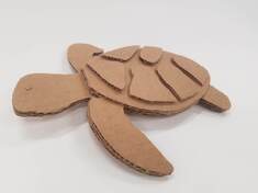
I think that the cardboard project really made me think hard about all my choices. I had to think about how I wanted to layer it and what I wanted emphasized like the shapes on the shell. I also had to think about how to make it 3 D by making certain limbs have an extra layer and by having the eye be an extra layer. I think my choices helped enhance the turtle as a whole because it really gives it the 3 D effect and instead of being flat it like comes out of the cardboard which I think is kind of neat. It's hard to do that with a project like this where you only use one medium but I like the choices I made and I think it turned out pretty good.
I think that the cardboard project really made me think hard about all my choices. I had to think about how I wanted to layer it and what I wanted emphasized like the shapes on the shell. I also had to think about how to make it 3 D by making certain limbs have an extra layer and by having the eye be an extra layer. I think my choices helped enhance the turtle as a whole because it really gives it the 3 D effect and instead of being flat it like comes out of the cardboard which I think is kind of neat. It's hard to do that with a project like this where you only use one medium but I like the choices I made and I think it turned out pretty good.
Which project was your least successful? Explain why you consider this work of art unsuccessful? If you were to create this project over, what changes would you make?
I think that my frame is most unsuccessful because it did not happen the way that I thought it would at all and honestly I kind of hate it. They were supposed to look like fish and instead they look like...something else. That could have been prevented if I had though more about the proportions and sizes that everything should have been. If I were to redo this then I would instead put the fish on the sides on the frame instead of the top and bottom so everything can be more proportionate. I would also want to add more than just the colors I used, like I would want to add more detail because the painting that was put in my frame was so good and in comparison my frame looks like something a 5 year old made. If I were to do it again I would definitely spend more time on it than I did and make it exactly the way I wanted it to look.
I think that my frame is most unsuccessful because it did not happen the way that I thought it would at all and honestly I kind of hate it. They were supposed to look like fish and instead they look like...something else. That could have been prevented if I had though more about the proportions and sizes that everything should have been. If I were to redo this then I would instead put the fish on the sides on the frame instead of the top and bottom so everything can be more proportionate. I would also want to add more than just the colors I used, like I would want to add more detail because the painting that was put in my frame was so good and in comparison my frame looks like something a 5 year old made. If I were to do it again I would definitely spend more time on it than I did and make it exactly the way I wanted it to look.
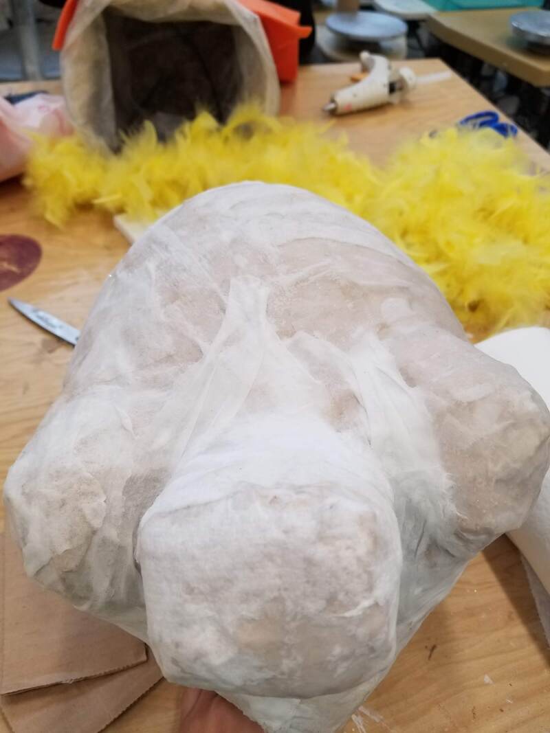
This is the paper mache piece, it's supposed to be Miss Piggy but we forgot to get a piece at the end, but we hadn't finished with it anyways, all we got to was the paint we still had to add the ears and attach the background. The process of paper mache is that you start with a balloon and make it the size you want and then add newsprint or paper towels and you keep layering them on until it's not soft anymore. Then you add the smooth paper towels to smoothen everything out and after that you can choose to sand it if you want to get it even more smooth. Then after all that you wait for it to dry and you paint it and add whatever you want to it. I think the successful part was getting the shape of her head because we had reference pictures and they helped a lot, however towards the end she fell so her head isn't as round anymore :(. Shaping it was definitely difficult and so was doing all the layers because we had started with paper towel which took forever and then we used newsprint and had to do a lot of layers of that and it just took a long time.

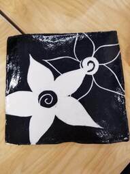
So my process for this was that I started by making a slab and cutting it to the size I wanted, then I underglazed the whole thing and started to carve it. Since my original design idea didn't work out I didn't use references for this design I just kind of went from memory. After I got my design the way I wanted it it got fired and then I glazed and fired it again and I really like the way it turned out I just wish the edges were straighter. I thought the sgraffito process was fun, it was kind of like the linoleum we did in art 1 which I also liked. I like the way my piece turned out but if I were to change it I would try to get the edges more even and maybe add more to the design like some patterns or more flowers or something.
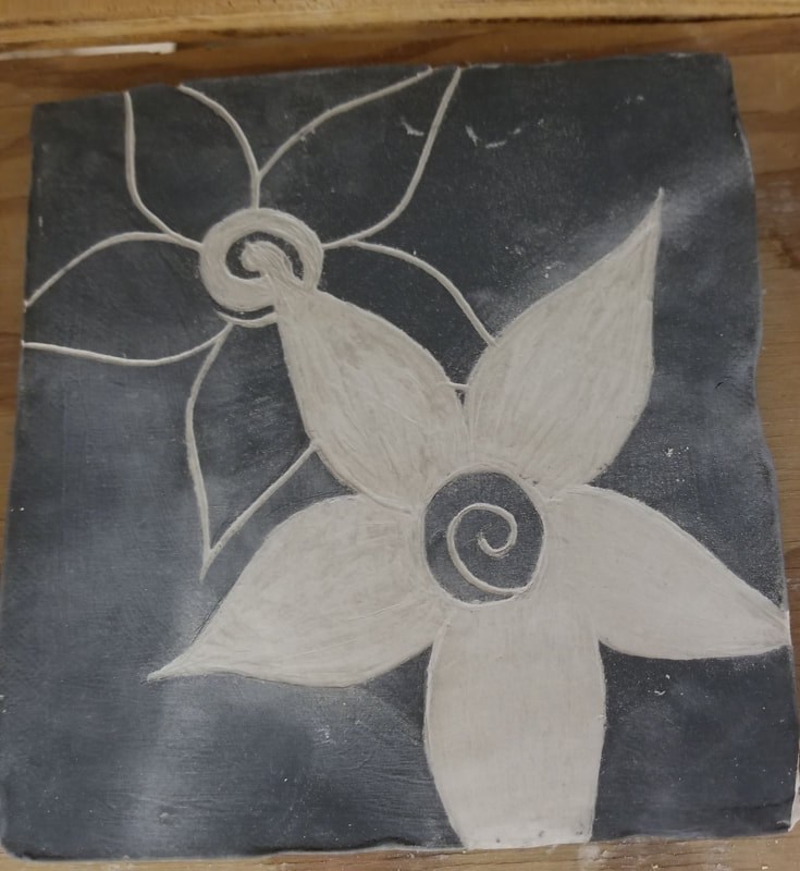
This is my in progress sgraffito piece before being glazed and fired. I didn't actually have a plan for this because I tried to do something else before with my star sign and an ocean wave but it looked bad so I started over and did this which I actually like much better. My inspiration was that when I'm bored in class I draw these kinds of flowers on my papers so I made it here. So far, I rolled out my slab of clay and beveled it, then I used black underglaze to paint the whole thing and then I lightly drew out my design and carved it and so far I kind of like it.
I didn't get an in progress picture but for my coil piece I actually didn't use a template but I kind of like the way it turned out, even though it is a little lopsided. My wheel piece broke a little on the bottom which it why it's so uneven because I tried to sand it down but it didn't really work that well. Pit fired pieces have to have a lot of work put into them. First they have to be shaped, then burnished with the little rock to make it shiny, then bisque fired, then you have to add all the things you want to make the colors, then they get pit fired and then finally cleaned off and sprayed to look shiny. The process is long and time consuming but worth it because they all look really cool and unique in the end. I think my pieces were successful with the colors I got on them but if I were to do it again I would try to add more. If I did it again I would also spend more time shaping them and burnishing them to give them a cleaner looking finish. For my piece I burned salt, dog food, eggshells, sawdust, and the tea from inside tea bags.
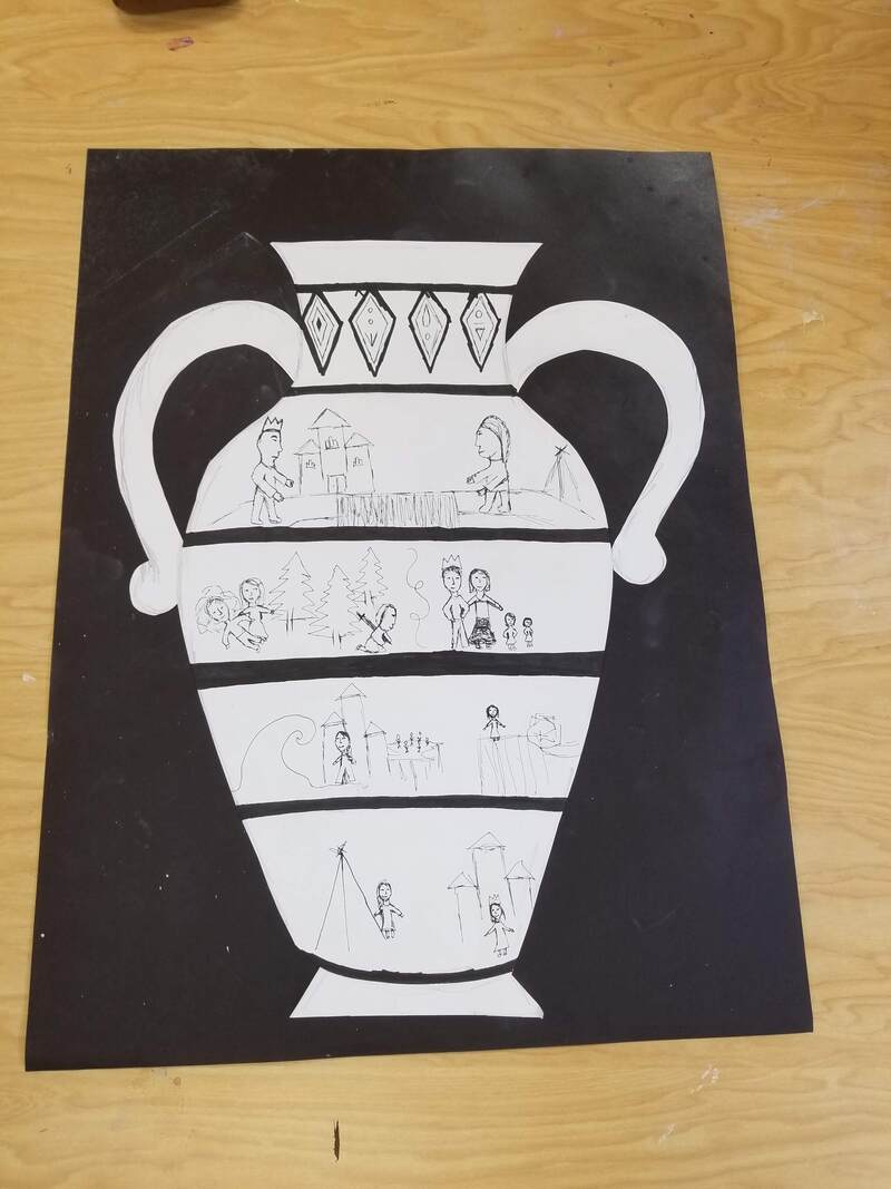
This was the Greek Pottery Paper Project and my group did the story and what happened in Frozen 2. Sgraffito is the Italian word for scratch and registers are each line in the story. We chose the vase design with the 2 handles because it was our favorite.
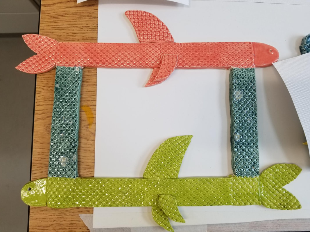
I didn't get a photo of my frame in progress but as you can see my theme is fish and I showed it by having 2 fish. I think the texture that I used was successful, I was worried that it might go away but it stayed and I like it. I would change the shape of some of the fish parts I think it looks kind of awkward and long. First I made the basic rectangle shape of the frame. Then I made the head, the fins, and the tail. Then I added the stencil texture and scored and slipped all the parts on. After that I fired it and then glazed it and fired it once more.

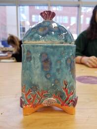
So for my mug, it's actually more of a jar, but first I made the tripod shape and then the next day I added the carvings of the coral designs. After that I made the little sea shell designs and scored and slipped those on and made the sand design on the very bottom. After all that, I tried to make the handle but it didn't work out so well so I added a lid instead by making a pinch pot and then I made a little sea shell to put on the top as the part you use to lift it. So far I think that the successful parts are the lid as well as the little sea shells I think they're really cute. I also really used the colors that I chose to glaze it with I think it looks fun and ocean-y. A clay slab is clay that has been wedged and then put through the clay roller to make it all an even slab.
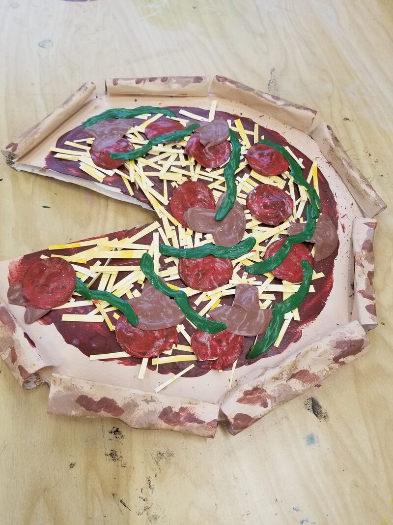
I worked on this project with a group and we didn't really look at any inspiration pictures, we knew we wanted to make a pizza. We also forgot to take pictures with the white background. Some pros are that it actually looks like a pizza and the colors we used turned out really good I think. Some cons are that it looks kind of messy and the crust separated and is all empty on the inside which I think makes it look messy. The first thing we did was the base, we made a circle and then attached the rolled pieces for the crust. Then we painted that part and painted on the sauce. Then over the course of a couple days we put paint in the shapes we wanted for the toppings, let it dry, and then peeled it off. Then we painted and cut up paper for the cheese and finally we glued it all down.
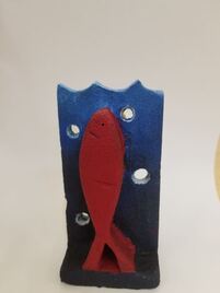
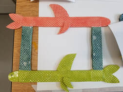
At first I wanted this to be one 3-D fish but as I was doing it I realized I had no idea how to do that so instead I made it 2 fish on either side of the water. The main obstacle I faced at first was trying to do the one fish and then later on it was tricky to do the bubbles in the water without breaking the foam because it had gotten kind of thin. Eventually though I made the bubbles and it didn't break. I knew I wanted to do a blue ombre for the water so I used red and yellow because I thought they would pop but also it would all go together. I think the red fish was successful, I accidentally made the yellow one too skinny, I also like the way the water turned out.
I think that this was successful because at first glance you can tell what it is and its cute and simple. If I were to do it again I might add detail to the little shapes on the shell to give it more texture or design. Advice I would give someone else starting this project is to plan your piece carefully, and know exactly what you're going to do for each layer.
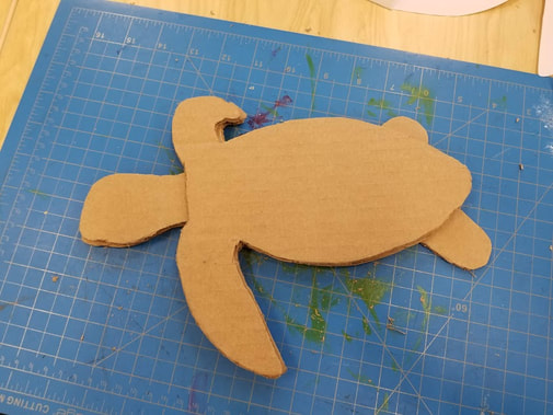
My plan for this piece is to add a few more layers and eventually have the shell and the little pieces on the shell pop out. I like the way this looks so far but I'm having trouble with cutting it exactly the way I want it especially for the rounded parts, those are hard to cut.
